

Designed to Feel Lighter
A drink shaped by restraint.
Clear ingredients, clear intentions, and nothing unnecessary in between.
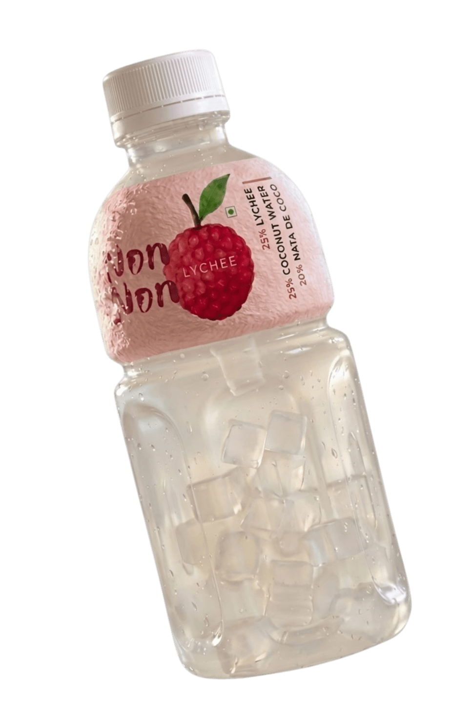
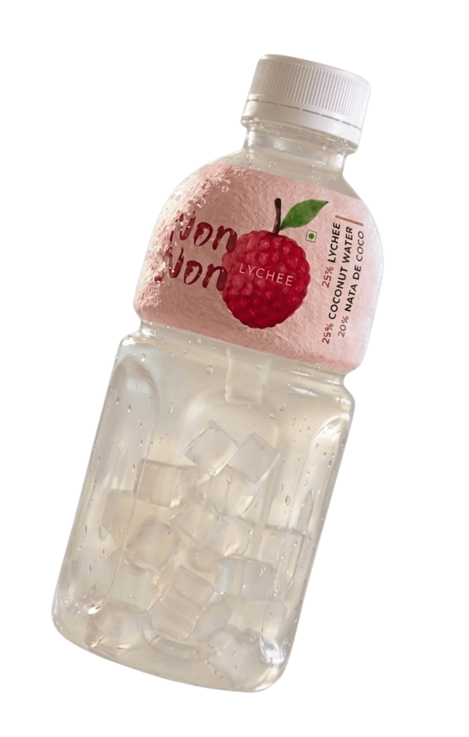

The idea was straightforward.
Make a drink that feels lighter to look at, easier to hold, and more intentional overall.
Not lighter as in watered down.
Lighter as in nothing unnecessary.
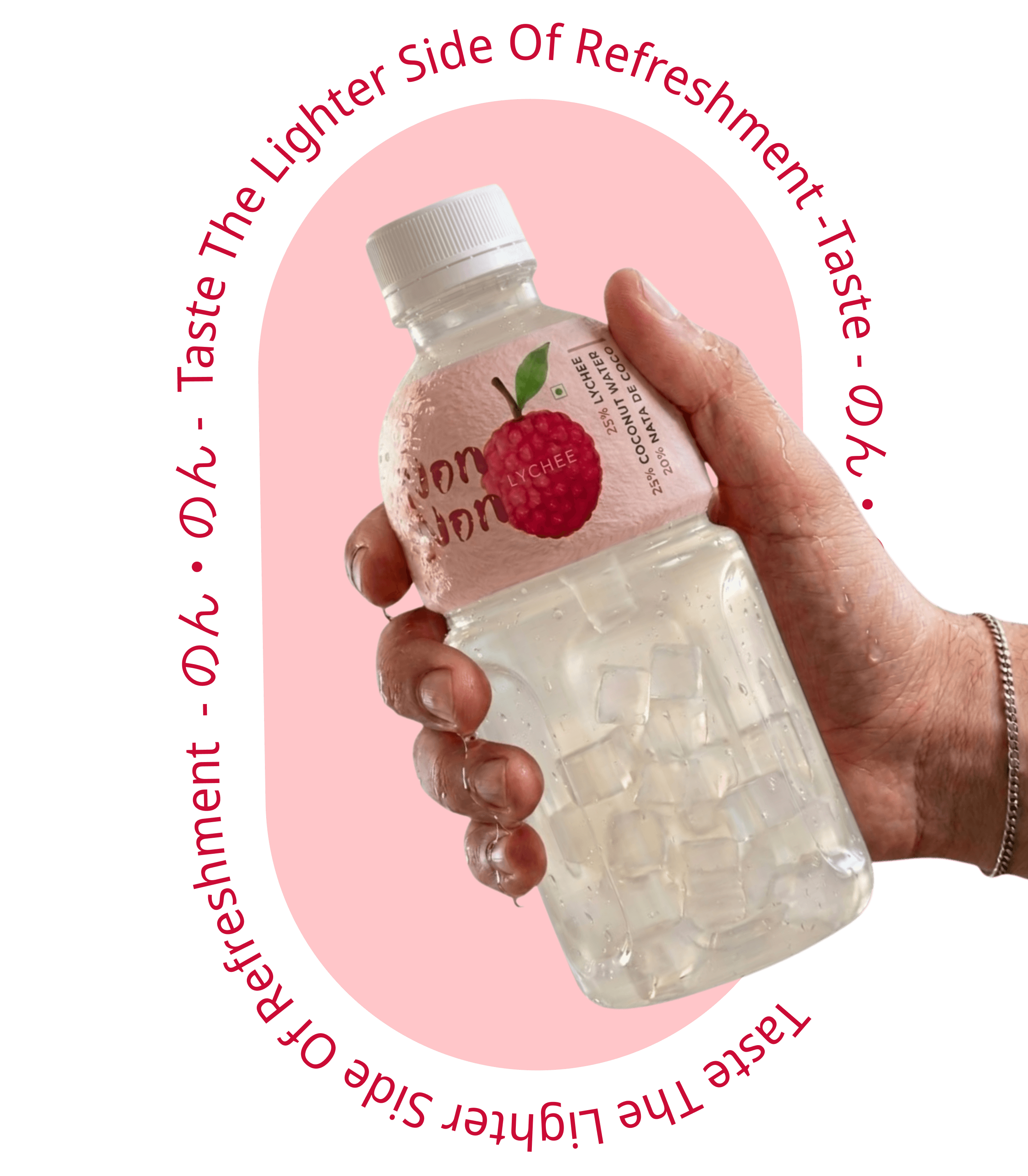
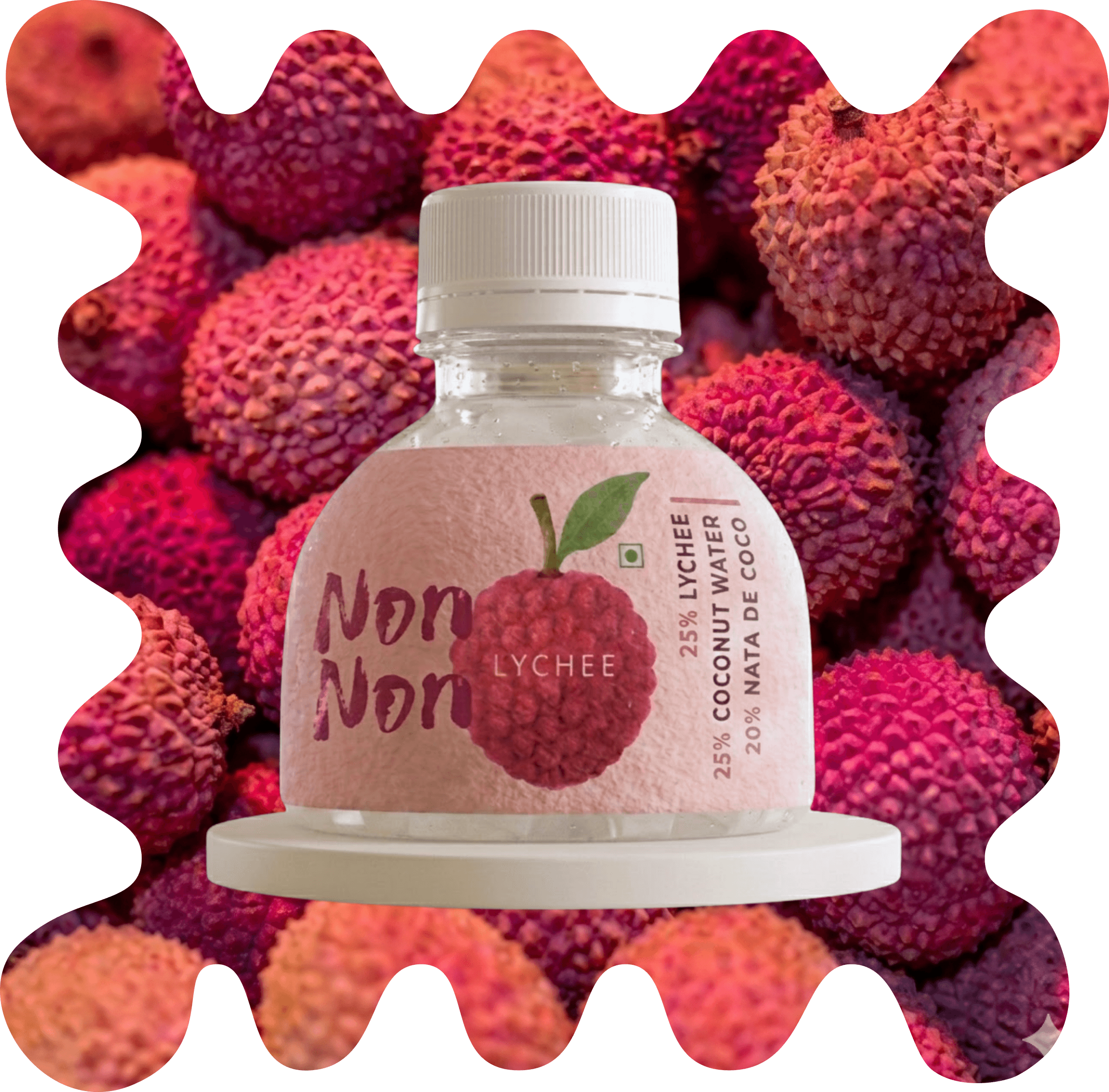
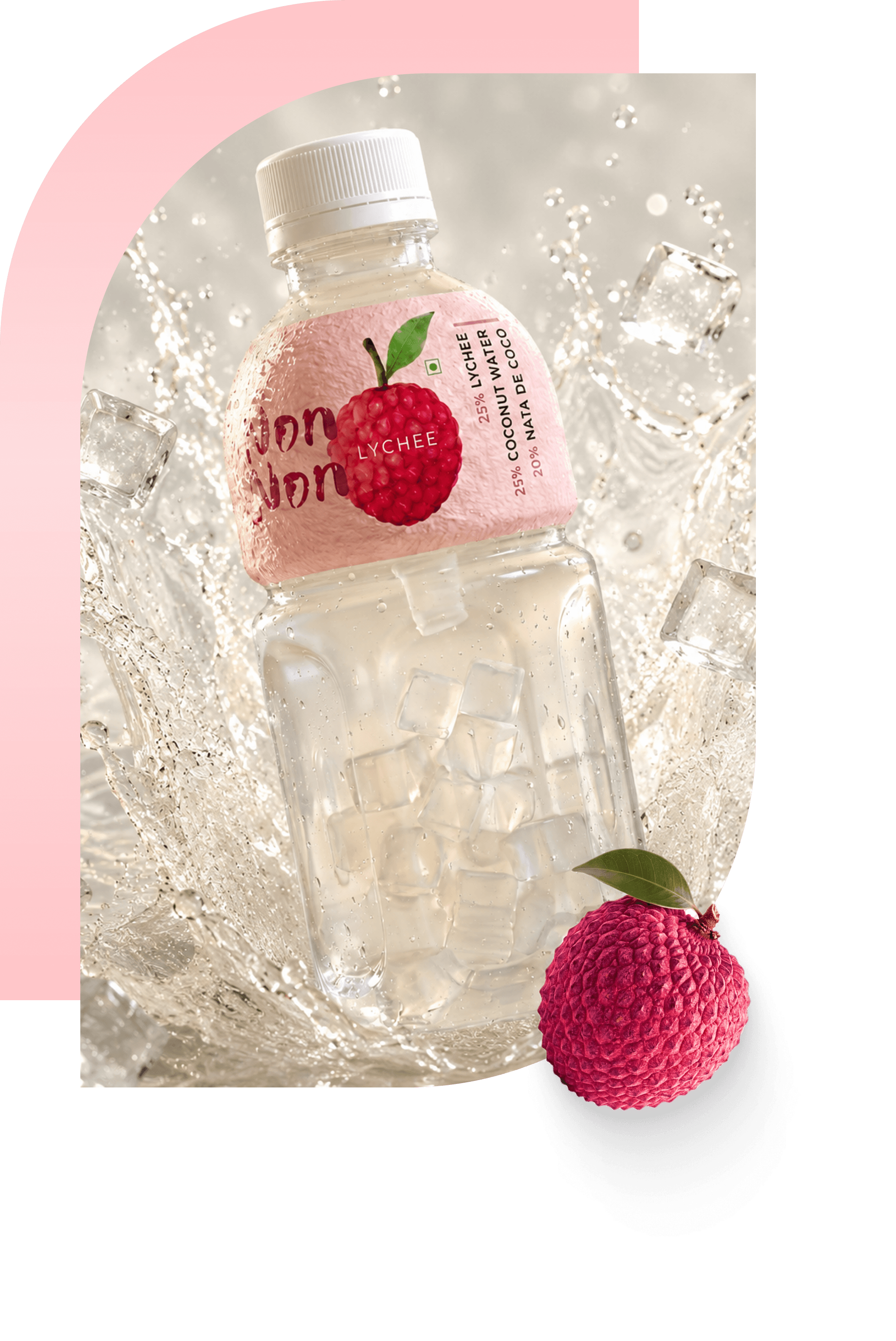
The label was designed to not compete with the bottle.
The bottle was designed to not compete with the drink.
The drink was designed to not compete with itself.
Every decision was made with that logic in mind.

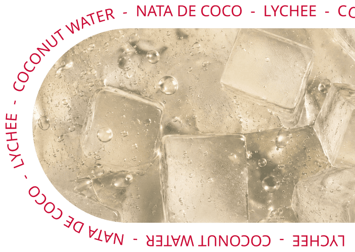
The floating nata de coco cubes.
The transparency of the liquid.
The clear PET that holds nothing back.
These are not packaging choices.
They are the identity.

The current focus is one product, done well.
Future releases may follow.
They will follow the same logic:
only what is necessary. Nothing more.